lol
What you talking about Willis?
When communicating ideas it’s can be really hard to get the message straight. I like to have a really good conversation first, preferably not over email, to make sure we are all on the same page. I also have a branding questionnaire for clients to fill out before we start anything major like a new logo or brand. A bit more communicating in the beginning makes the process easier for everyone. How do others feel about filling out forms to help get their ideas down?
Good, Cheap Fast
This simple graphic I’ve seen many times as a venn diagram but never as an animation. I have often wished you could explain it really simply to clients ‘There are three things with design: GOOD, CHEAP, FAST but you can only have TWO!’
When I design the most important thing is definitely GOOD.
New look website
Introducing my new look and feel website
Read MoreThrowback Tuesday
Having a nostalgic moment today looking at some of my really early graphic design work. I found this example which could well be the very first paid identity job that I did. Loving its retro look now and remembering how contemporary it felt when first created! Noticed the date on the envelope and it’s the first of April - April fools - ha ha.
I am really happy to find this example of early work and see that consideration was made with the stock - a kind of semitransparent paper, the colour of the paper for the letterhead and envelopes to match. All done with a single colour no doubt to bring costs down.
So often we are tempted to throw things out and keep only digital records but it was a wonderful whiff of nostalgia to see and touch this old relic.
Sagmeister & Walsh BEAUTY
I’ve long been a fan of the work of the creative team Sagmeister and Walsh based in New York city. I’ve gone down to Melbourne to attend a workshop with Stefan Sagmeister and dragged a teenager daughter to one of his talks at the Livid Festival in Sydney - she enjoyed it too, phew. So I was excited to see this new collaborative exhibition about Beauty that Sagmeister and Walsh produced last year. Delving a little deeper I discovered this 10 minute talk about Beauty and how
‘Something was lost when functionality replaced beauty in art and design’.
Now that we all have more time to reflect, my vote is we get involved in creating more beauty in our world. Link to approximately 10min Sagmeister video talk here https://www.youtube.com/watch?v=fXaF0bIthB0 and link to the page for the exhibition on their website here https://sagmeisterwalsh.com/work/all/beauty/ if you’ve got some spare time I highly recommend having a look at their other projects too.
Enjoy! Oh and any family members reading this, the printed book would make an excellent birthday present ……
Miranda x
Penny Flanagan bookcover
New bookcover design for novel by Penny Flanagan, here is her sister Kitty Flanagan having a read
Read MoreGet Out and Vote poster designed by Milton Glasser. "Full participation in the electoral process protects our ideals," said the designer, who co-founded New York magazine and created the famous I Heart NY logo.
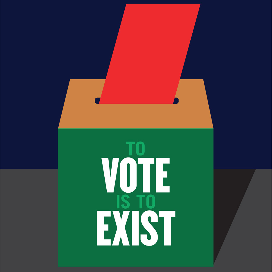
Graphic Design and the US election
The American Institute of Graphic Arts (AIGA) have reached out to their community of graphic designers to come up with posters to encourage the public to get out and vote. Their designers have answered the call with big names like Milton Glasser - who designed the iconic I HEART NY logo in the 1970's, to Paula Scher who is known for her identity and wayfinding graphics.
Over 100 designers have already contributed to the campaign, and all AIGA members are eligible to participate. The posters are all available to download from the organisation's website.
Each measures 11 by 17 inches, in A3 vertical format, so they can be easily printed out. The AIGA hopes that they will be displayed in public locations such as small businesses, workplaces and schools, particularly in areas with historically low voter turnouts.
Design has had a long history with social change and political influence. Here is yet another example of the power of design to move people and motivate change in behaviour.
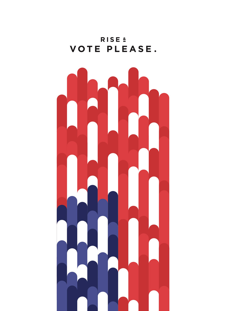
Jesse Wu's Rise & Vote poster
Kevin Garrison's Power and Liberty to All poster
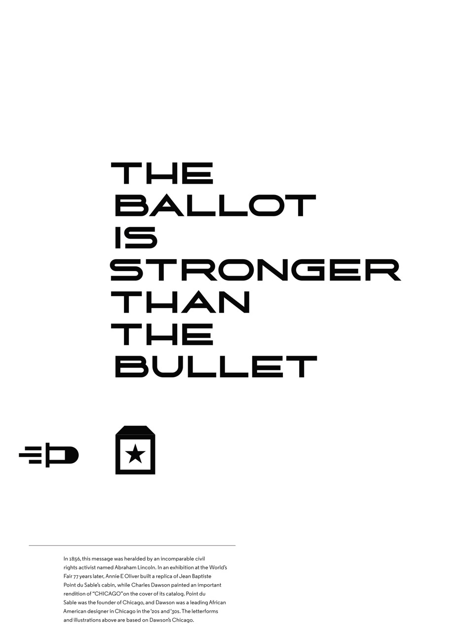
Tanner Woodford's The Ballot is Stronger Than the Bullet poster


